As a society, we are placing a greater emphasis on health and wellbeing. Increasingly, we want our homes, our workspaces and local communities to reflect this change. For the team here at Box Architects, we are continually exploring new ways of becoming more aware of the importance they have on staff. Our aim is to build a healthy practice from the inside out. But we are equally committed to creating places for our clients where people can flourish. And one area we have begun to explore is the psychological impact of colour.
There are essentially three basic elements of design in painting, sculpture and architecture: colour, form and line. Painting has been associated with colour, sculpture with form and architecture with line. But colour is not exclusive to painting, for colour is clearly an expressive element in architectural design.
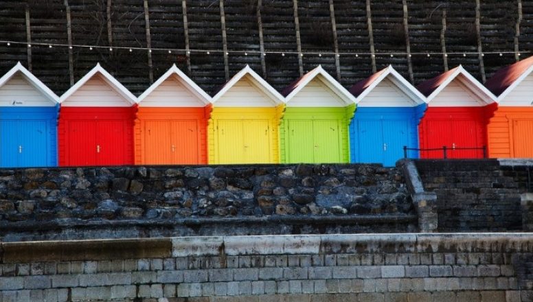
In art, colour is the means by which a piece of work transmits the same sensations that the artist experienced. In the world of architecture as in the world of art, colour can create sensations or awaken feelings. It transforms, alters and embellishes when applied correctly. But it can equally upset, mismatch and even nullify the beauty of materials.
The presence of colour in cities is fundamental since it establishes the identity and the structure of its image. Everything that the architect constructs – every representation made on paper and every model of the building – involves a colour scheme to some degree.
Colour can be used to emphasise the character of a building and create harmony and unity, or it can be deliberately applied to contrast, enliven or emphasise its structure. It may also affect the way in which people respond to their surroundings. Colour can enhance a mood of calm or happiness. By contrast, it can boost more unpleasant or undesired emotions.
Colour is known to have both psychological and physiological effects on humans. It is why business owners and marketing professionals often give special attention to the colour selection when designing their stores, websites and logos. This knowledge of the colour psychology can be transferred to healthcare environments. As it has been proven to accelerate healing, lift spirits and calm nerves, its strategic use can create a supportive environment.
Being admitted to hospital or simply visiting a loved one is not a relaxing experience. Prolonged stress can suppress important blood cells, weaken the immune system and make recovery more difficult. Hospitals can encourage calmness by incorporating blue, green or purple into their colour schemes to have a calming effect.
It is important to avoid overly bright colours such as red and yellow on adult wards as they are known to raise anxiety levels. However, in a children’s environment, the introduction of yellow and orange may help younger patients to feel happy and relax. It is also known to reduce stress and anxiety.
This increased knowledge and acceptance that colour can and indeed does have a significant impact on a patient’s perception of their medical care and in some cases, their actual recovery, is fascinating. As a practice, we are committed to expanding our presence in the healthcare sector. This means that we will continue to delve deeper into the fascinating psychology of colour to ensure we create spaces in the healthcare sector that can have a positive impact on patients and visitors alike.